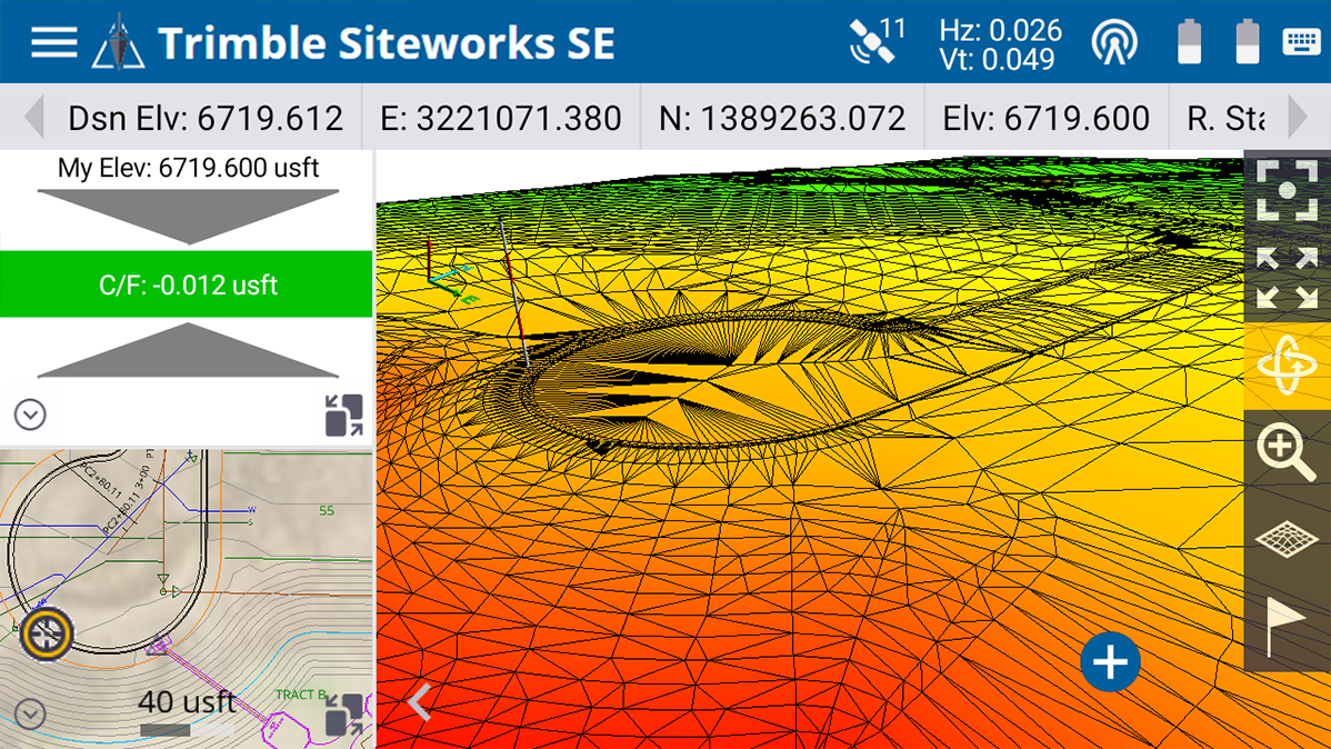
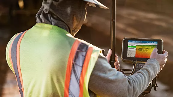
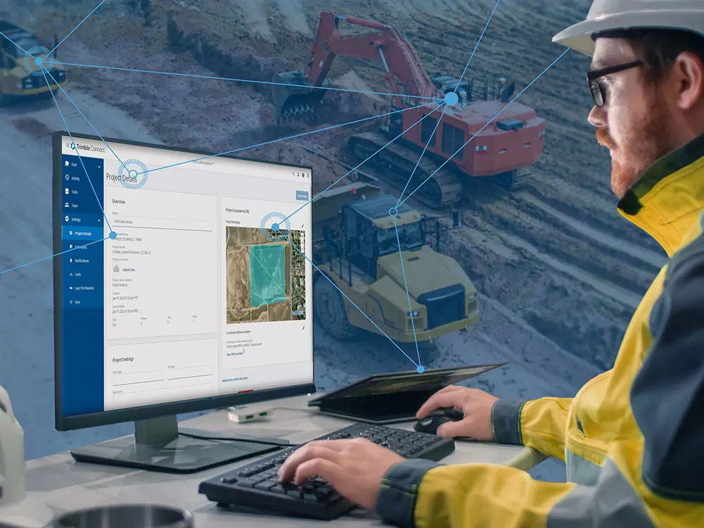
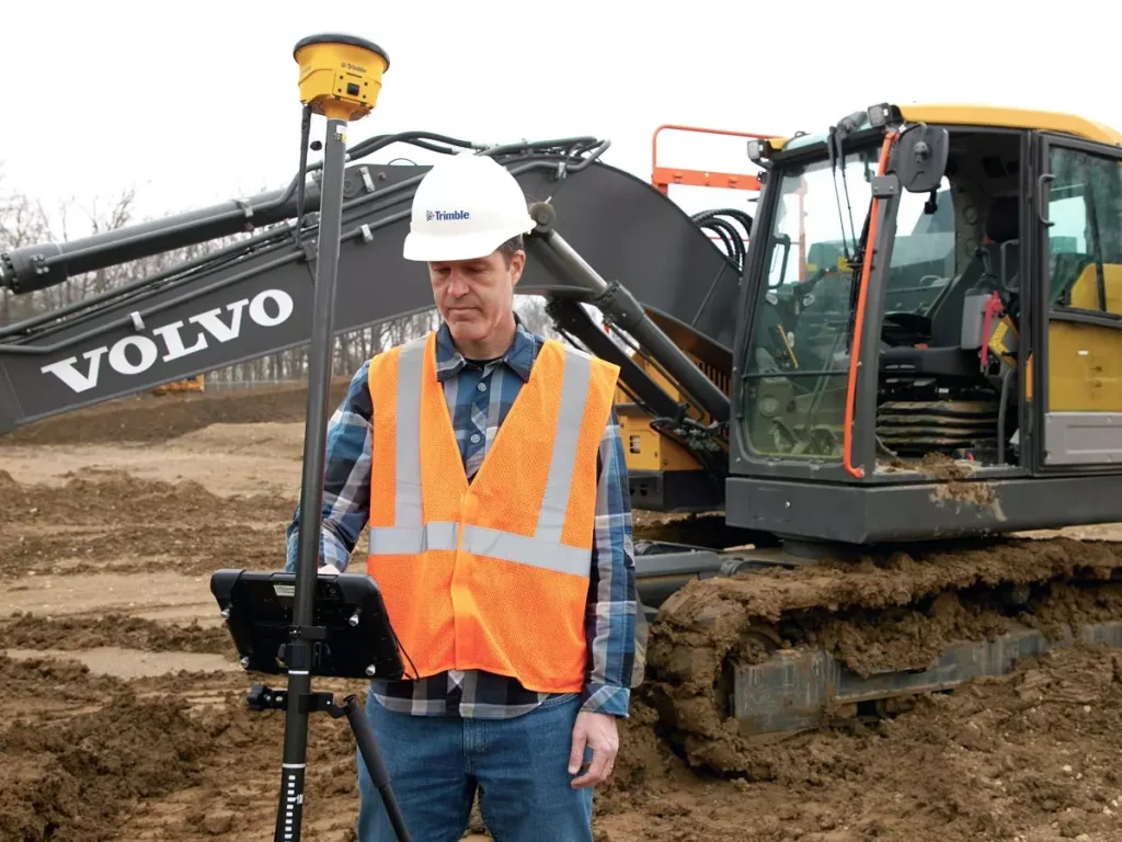
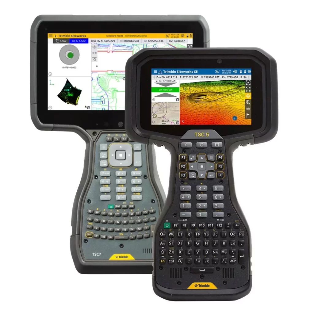
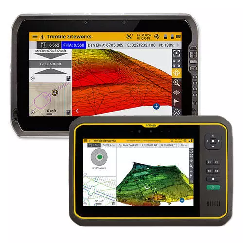
We actually took a lot of cues for Trimble Siteworks from Trimble Earthworks, the next-generation grade control platform from Trimble. The Trimble Earthworks team invested a lot of time, money and effort into the Trimble Earthworks user interface. That team worked with researchers and UI experts who helped them really understand how people interact with their devices, and then used that knowledge to develop intuitive interfaces. Much of this insight was gleaned from the way people use their smart phones, iPads and other consumer handheld devices.
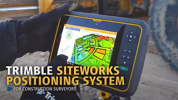
Our development team made a conscious effort to apply the knowledge from the Trimble Earthworks UI team to Siteworks. We were very intentional about using the same icons, look and feel, and even color schemes so that Trimble Siteworks feels familiar and comfortable to Trimble Earthworks users. We also put a lot of effort into making the controller ergonomic, well-balanced and easy to carry and handle in the field.
We will continue to use the insight gained from other industries, from other Trimble products, and from our users for future releases and development of the Trimble controllers, Trimble Siteworks, and other products designed for the civil engineering and construction industry.

